Improving accessibility in Wire
Designing inclusive experiences across Wire messaging platforms
Context
Digital accessibility (A11y) is not optional — especially for a messenger app like Wire, that is used daily by a wide and diverse audience. Beyond private communication, this product plays a critical role in business environments, NGOs, and governmental organizations. People rely on it in high-frequency, high-importance situations, making inclusive access essential.
An accessibility audit of the existing app revealed major gaps. At the time, the product failed to meet even half of the requirements needed for WCAG 2.1 AA compliance. Key interaction patterns and design decisions created barriers for users with disabilities, indicating that accessibility had not been considered at a foundational level.
Rather than applying surface-level fixes, the decision was made to redesign the product with accessibility as a core principle.
Within this project, I was responsible for defining and driving this transformation. My role included creating a new, accessibility-first design library, defining the overall interaction concept, and leading and overseeing the entire redesign process. I worked closely with engineering teams, providing guidance, training, and ongoing accessibility reviews, and in some cases directly advising on implementation details. Additionally, I was partially taking on product management responsibilities to ensure alignment between design, technical feasibility, and business goals.
Project summary
Turning accessibility requirements into reusable patterns
One of the core issues identified during the accessibility review was the inconsistent and often unclear definition of interactive states. Buttons and controls frequently relied on subtle color changes, lacked visible focus indicators, or behaved differently across themes and contexts. This made keyboard navigation, screen reader usage, and general usability significantly harder than necessary.
As part of the redesign, I introduced a systematic and accessibility-first approach to interaction states within the new design library. Every interactive component now follows a clearly defined and consistent state model — including enabled, hover, focus, active, and disabled — across light and dark themes.
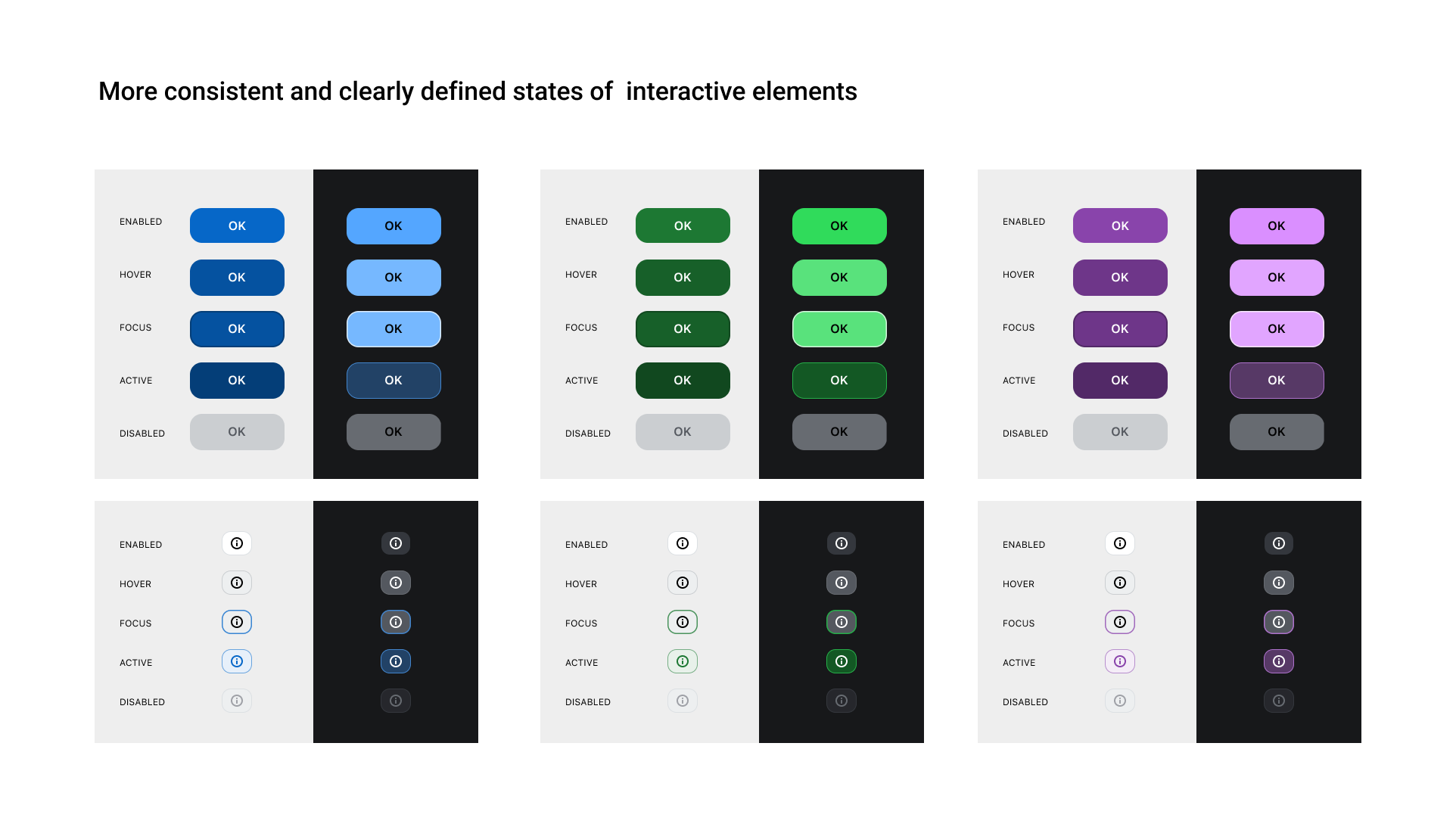
Each state was designed to be:
- Visually distinct, without relying solely on color
- WCAG-compliant in terms of contrast and focus visibility
- Consistent across components, reducing cognitive load and implementation errors
- Technically unambiguous, making it easier for engineers to implement and maintain
WCAG-compliant color system
In the previous design, there was no clearly defined distinction between light and dark mode. Half-transparent overlays, glass-like effects, and blurry background images were frequently used, causing unpredictable contrast and readability issues.
As part of the new design library, I rebuilt the color system from the ground up with accessibility as a non-negotiable constraint. Clear and distinct light and dark themes were introduced, each with defined background levels and usage rules. All primary accent colors were tested and adjusted to meet at least AA contrast ratios across these surfaces.
Rather than treating colors as isolated values, they were defined as context-aware design tokens. This removed ambiguity for both designers and engineers and ensured that text, icons, and interactive elements remain readable regardless of theme or background.
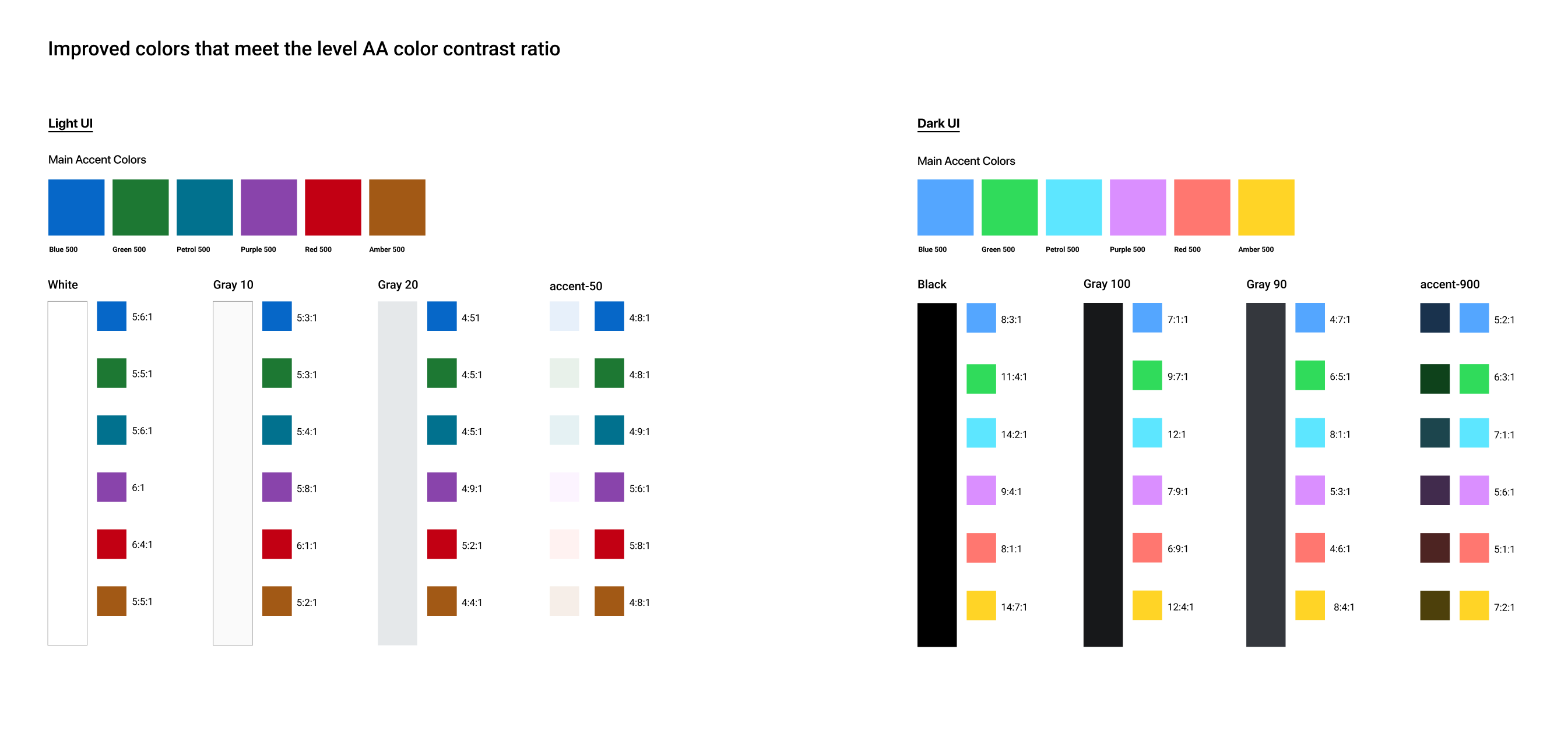
The result is a color system that is::
- WCAG 2.1 AA compliant
- Clearly structured for light and dark UI
- Free of contrast-breaking overlays and effects
- Scalable, predictable, and implementation-safe
Outcome
From fragmented design to an accessible system
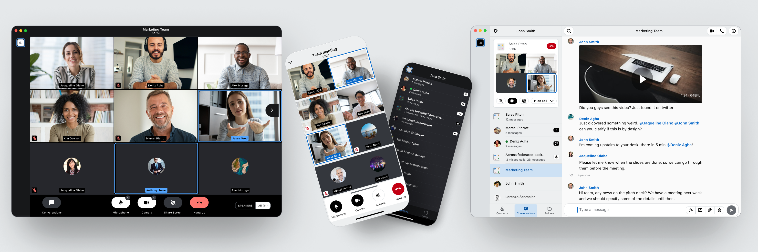
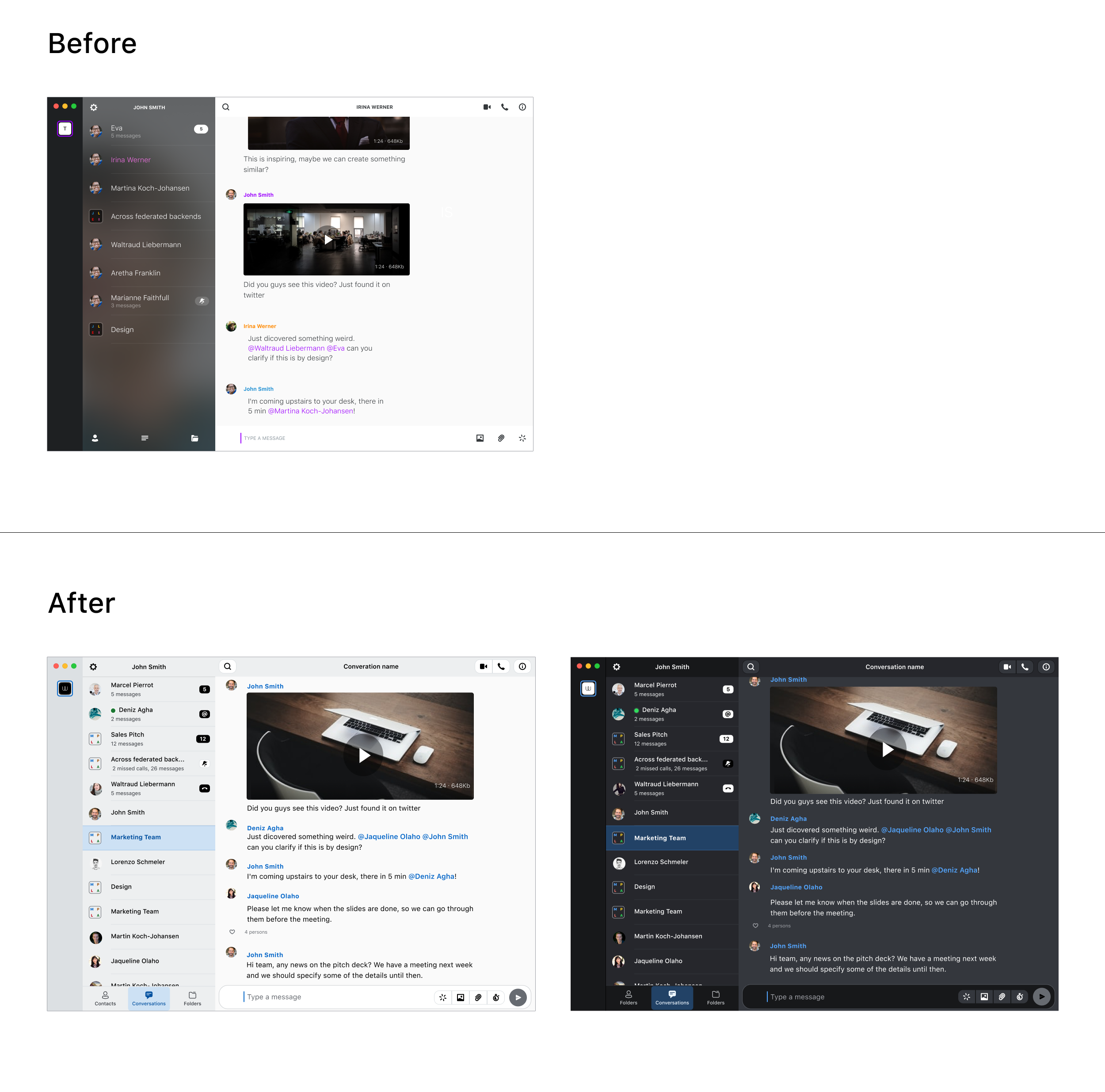
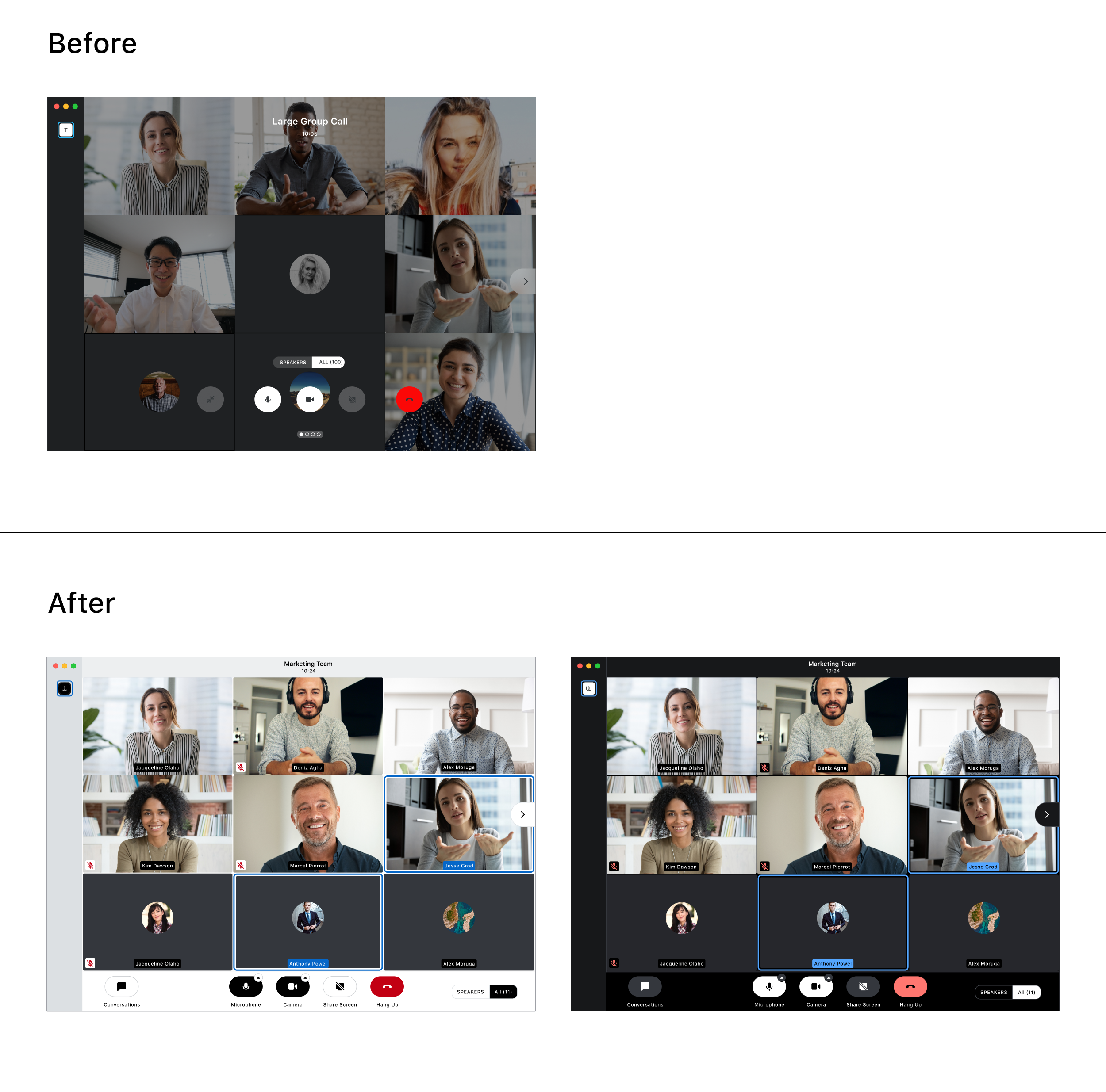
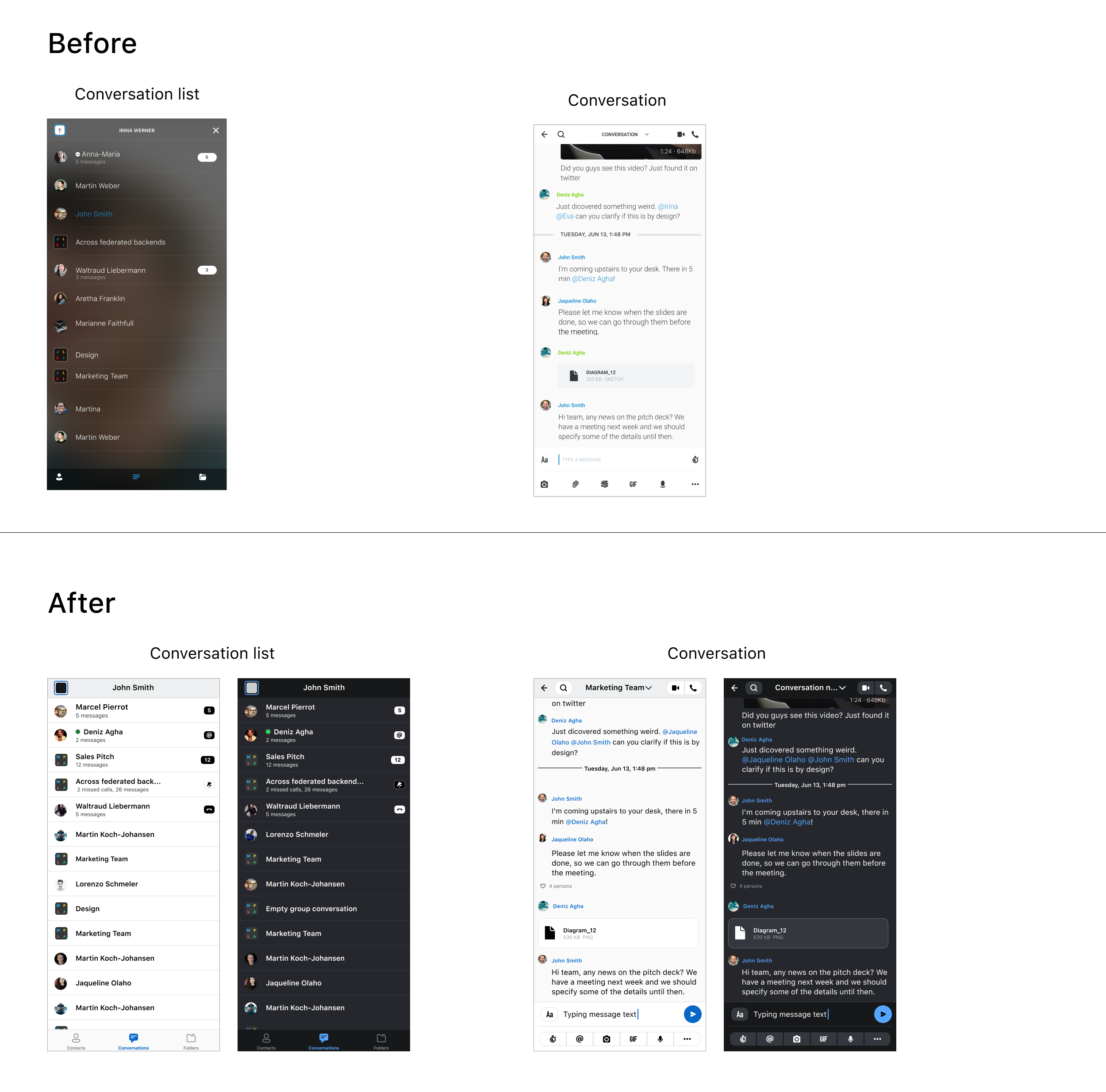
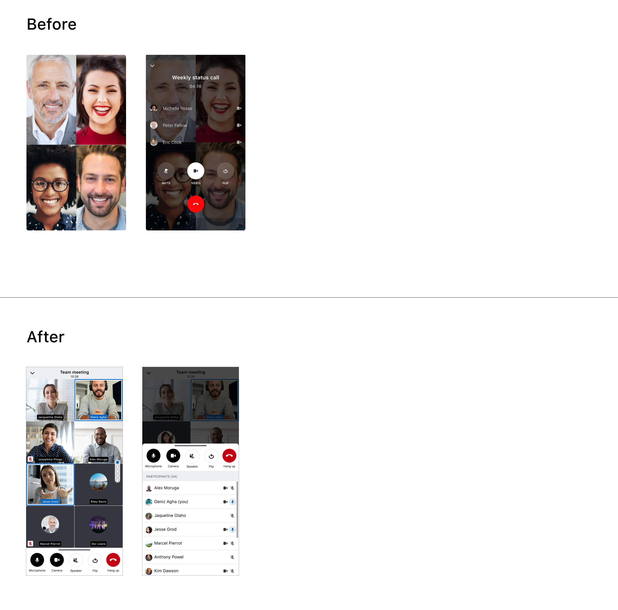
Selected before-and-after examples highlighting the impact of the redesign.Conversations view
Desktop Calling UI
Mobile (iOS) Conversation Screens
Mobile (iOS) Calling UI
Further project description...